Visualizing Network Traffic with WebGL
“Finally,” I thought, “an excuse to play with WebGL at work!”
This year, I had the good fortune of contributing to a keynote presentation at Red Hat Summit. During the keynote, an audience of 5,000 played a mobile web game created by our team. The game was backed by several microservices which we modified on stage while the audience played.
My contribution was to display, in a visual and engaging way, the live network traffic flowing through our system.
Being a web guy, I wanted to accomplish this on a webpage, but with such a large audience, the number of network requests would rocket past what could be efficiently rendered with HTML and CSS.
# Tiny Particles of Sand
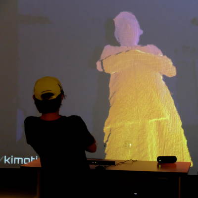
While developing DiMo and Kimotion, I became fond of three.js particle systems for their performance and visual charm.
WebGL particle systems can handle many thousands of particles without breaking a sweat. It can even handle drawing millions of particles, although moving that many particles is often CPU-bottlenecked. Fancy tricks can beat that limitation, although such tricks are still tedious in WebGL.
Alright, let’s make some particles.
# It’s Pixel Time
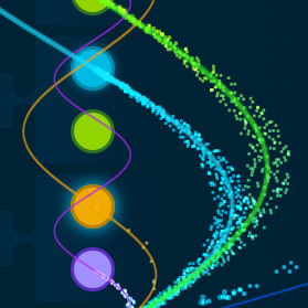
When a network request is detected, the particle system moves a tiny dot in an arc to its destination.
The arcs are defined by sine waves. Here are the particle arcs as they appear on-screen, and another shot with sine wave guides showing.
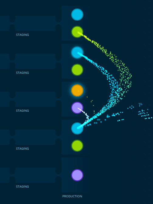
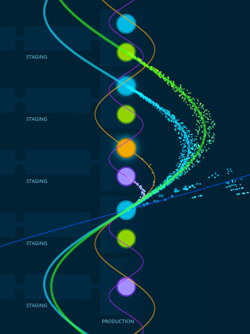
To prevent the arcs from overlapping with each other too much, I increased each wave’s amplitude based on vertical distance to be traveled. In essence, amplitude increases linearly with wavelength. That’s why the green arc is bigger than the blue arc, etc.
Initially, the particles traveled in single-file, which obscured the quantity of particles. To remedy that, I added a small random horizontal offset unique to each particle. The offset diminishes at the ends of the arc, which causes the particles to fan out near the middle.
The particles that enter from the right side of the screen represent network traffic from the audience. As you can see in the video below, the origin point of those particles moves randomly up and down to add more visual interest.
# Together at Last
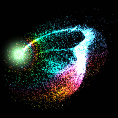
After months of collaborating from across the world, it was wonderful to meet the whole team in person. A few days later, all our hard work came together as well. All the preparation paid off and the demo worked perfectly. Here’s a shot of my particle visualization from the official recording.
Watch the full keynote here:
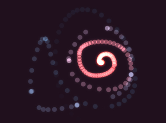
# Glow Rope
Early on, before traffic data was available, I had the particles follow the mouse instead. It was pretty fun, so I spun it off into a simple demo called Glow Rope. Give it a try (mouse required)!
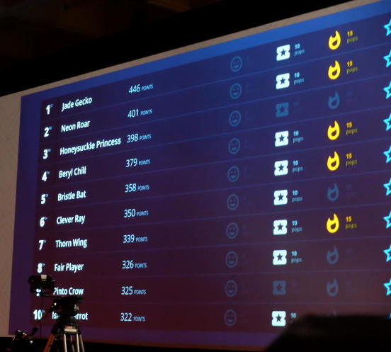
# Leaderboard
In addition to the network traffic visualization, I helped build a leaderboard view to display the scores and achievements of the top 10 players in the audience. Andres created the beautiful design and handed me a static mockup which I converted into a dynamic template using Ractive. I then created a WebSocket connection to the score microservice to populate the data. Here’s a shot of the winners from the live audience.
# Next Year
The amount of work and preparation that goes into a presentation like this was eye-opening for me. A week out and tired to the bone, I was thinking “No way am I doing this next year!” But the thrill of everyone’s hard work coming together drove away the exhaustion. I can’t wait to see what we can cook up next year.